Monday, December 13, 2010

Santa was an elf and actually invented by Coca-Cola

Spoiler alert: The image we know as Santa was actually invented by Coca-Cola.

The first original image of Santa Claus started out in 1822 when Clark More wrote a poem for his daughters that would eventually be reprinted in newspapers. In his poem, “The Visit And St. Nicholas” our jolly friend is a slimmer character much more resembling an elf that could actually fit down a chimney. Try that one out on your young ones when you try to answer just how does the fat guy fit down your tiny flue.


St. Nick was plumped up to the Santa we now know by the editorial cartoonist Thomas Nast and made public in prominent in newspapers, magazines, and calendars by the famous chromolithographer Louis Prang. In the popular collected cards of the day called "scraps" (collected and pasted into a book––what we now call scrap books), Santa was not yet a jolly image, but much more severe persona appearing in a multicolored suit. Sketched by Nast,
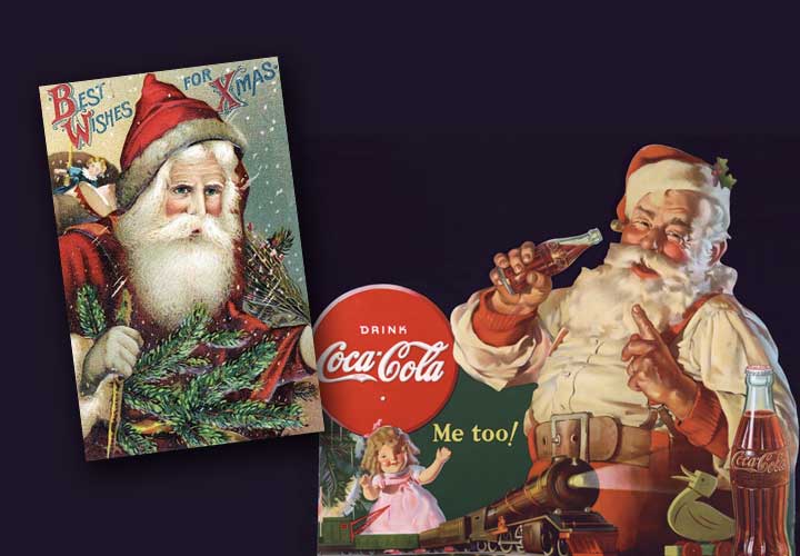
the old St. Nick that we know from countless images did not come from folklore, or from More or Nast but from the yearly Coca-Cola Company advertisements.


In the 1920s the Coca-Cola Company was struggling to make its soft drink a popular beverage during the winter months. Striving to make an all weather beverage, they came up with the campaign magic–“Thirst Knows no Season" and took it on the road with poster advertising just about everywhere.

These early marketing entrepreneurs made a serious effort to position their products around a specific calendar event. Christmas and Coca-Cola was all it. Santa drinking a Coke instead of the traditional milk and cookies began to push all other images of Santa aside. But the marketing strategies linking to a calendar event did not stop there. Soon many calendar events were a big part of product selling strategy. 


Some of these calendar events actually divided the year into memorable marketing sections. New Year's to Valentine's Day onto Mother's Day were all viable markets for the candy companies and they exploited them big time. You can't make it throughout the year without Halloween––which is the mother of all candy marketing strategies. Based on a pagan ritual that Americans took hold of and established as a holiday as quickly as they now look at ice cream and cookies and ask "Can you fry that?"
 

Given our current economic market, one might not be surprised by the interruption of a longtime tradition of the Thanksgiving meal. Black Friday has now become the early bargain hunter's deals on Thanksgiving day. What is to become of our time honored family tradition? Will Americans sit still at the Thanksgiving table while so many deals are available just one day earlier than Black Friday, or at best, be the bleary eyed participant at that meal who woke up at 4 am to get a great deal on a toaster oven?
 
There are so many marketing "events" now that one can't look at calendar and not see some type of money making extravaganza tied to it. If you can think of any event (large or small) that exploits human behavior, chime in and discuss on December 13. Post and recognize that nasty advertising agenda that twists our way of life and how we spend money based on a calendar date.
Visit my site:
www.wix.com/kevinmyersdesign/kevin-myers-design-modular

Wednesday, December 1, 2010

A Retro Art Look at the Polish Poster


The Polish Poster
If you know your World War II history well enough you'll remember that Poland got slammered on both sides. First, by a devastating invasion by Hitler from the West (with no real declaration of war), and second, only seventeen days later, by the Soviets on the East.The capital city of Warsaw was almost completely gone when all was said and done, and with it went any purpose for great art or design. But the Polish people at that time owned a resilience that was unmatched elsewhere, and within that mode of endurance the Polish school of poster art emerged

Henryk Tomaszewski http://www.aiga.org/content.cfm/henryk-tomaszewski-meeting-the-master led the drive to promote the art of the Polish poster as a prominent means of communication–a graphic idiom that eventually became a source of national pride. Put in perspective, Poland's electronic media was not even close its neighboring countries who had not been been dismantled by the effects of the war. The poster became the essential leader in communicating events in this communist country for many years.

Another milestone in poster history was in 1964 when the landmark Muzeum Plakatu was dedicated to this rich source of communication of the Polish people post Wold War II. The museum generated international attention and the polish poster exists today as a testament to the will of an entire generation exposed to war.

The hardships these people sustained through the realities of war and beyond continued to show up in their graphics, as the designers of these historical posters wore their hearts on their sleeves. The look of the Polish poster began to take on surreal, emotional and political aspects.

A major trend in polish posters sprung up in the 1960s and reached a high point in the 1970s. A darker more somber side carrying the weight of surrealism and political awareness in a reaction to the social constraints of the dictatorial regime in place was now apparent. The freedom so often denied the Polish nation in history was now becoming a subtle subject appearing in the Polish poster. 

Franciszek Starowieyski (above) was the first of the graphic designers to incorporate these frustrations of the Polish nationality into the work of his posters. Surreal and sometimes downright gory, the pictures produced by Starowieski have a tendency to stay with the viewer long after the images have been digested into the human psyche. http://www.youtube.com/watch?v=JfArAqBJwsA

Jan Lenica (below) pushed the imagery even further with a menacing and dreamlike quality of communication that even ventured into animated media. When a young Roman Polanski was asked to name his favorite Polish filmmakers, he cited only two—Andrzej Wajda and Jan Lenica. The first choice was not much of a surprise, but to single out Jan Lenica, a comparatively obscure animator, must have seemed a little puzzling. Lenica is probably best known in for his poster artwork for Roman Polanski's films for the Compton production company, Repulsion (1965) and Cul-de-Sac (1966). Both are childlike gouaches, verging on the abstract, though immediately distinctive. Like Polanski films, Lenica's career in poster art and set-design cultivated associations with the absurd, a preoccupation that culminated with a series of remarkable animations during the 1960s and 70s.
Waldemar Swierzy (below) polished his national style in a graffiti like manner with gestures into the wet paint working with a brush handle and incorporating a variety of media, sometimes incorporating watercolor, pencil and even crayon into one design. In his famous poster for the rock star Jimi Hendrix, this erratic movement with paint and markings bring the natural violence of the Polish poster into a unique vision. As spontaneous as his technique looked, it has been said he has been known to execute a single poster as many as five times before releasing the final.These designers carried a unique personal vision prompting others to join them in what became a famous national style that continues today.

A former teacher of mine at Tyler School of Art, Temple University was the Polish poster artist and illustrator Raphael Oblinsky who continues to create magnificent imagery in the vein of this tradition. Check out this contemporary master at http://www.patinae.com/olbinski.htm.


Wednesday, November 10, 2010

The retro art redesign of Details magazine

Reid Miles (left) and the retro art redesign of Details magazine

When art director Robert Newman arrived at Details magazine in 1998, the current editor Michael Caruso immediately decided on a redesign. The magazine at that time was read by 18 to 20-year-olds and had a skateboard graphic appearance. A downtown fashion style magazine, Details was acquired by Condé Nast and retooled as a magazine for young men. The readers abandoned by Rolling Stone and raised on cable television music videos.

Caruso told Newman he wanted more classic look that would appeal to readers in their mid-20s. A big fan of the Blue Note jazz record designs of Reid Miles, Robert took out his collection of the old 78 album covers and described his plan to use them as a point of departure in a retro art redesign.


The look of these albums describe the visual style and new way of life. "That look helped us crystallize the voice of the magazine," remembers Newman. "It was hard to tell where you were in the magazine" he says, “some sections and features weren't even in the same place every month. Michael wanted a more sophisticated architecture and the retro design of the Blue Note style fit the bill.

Newman adapted his blue note look for the section of the features in the magazine. You can see the cool jazz influence throughout the headlines and graphics. Type is stacked and stretched across horizontally and catches a pullout quotes seemingly cut with scissors all provide the feeling of the blue note record era. Materials organized in broadband and arrows in the black-and-white photos are tinted and cropped drastically all in the blue note style. 


The spread for the best of 1998 (top right) combines all these effects with it is type in active visual point of entry. "We use Photoshop, but try to make it look like it was done by hand” says Newman. Newman's Details redesign had the hot energy of its target readership. One spread for the ska band the Mighty Bosstones (above) has a caffeine energy of the music itself. "To a certain extent, Details was a rock 'n roll magazine,” says Newman, "we didn't want it to be too cool and had to look like rock 'n roll. It can't be old men in suits looking sophisticated.”


Back then, the magazine relied on sophisticated surveys to quickly get back feedback from the readers, and this quick flowing instantaneous graphic approach was well-suited to this process. “This is the print counterpart to the visual stimulation of television,” remembered  Newman. Can anyone find a redesign more perfect than Robert Newman's retro art approach in 1998?

Wednesday, October 13, 2010

The 1930s London Transport–Enduring the Test of Time


Poster design reached new heights with the London Transport of the 1930s. A keen supporter of contemporary Art and design, it would commission a number of high-profile artists to create publicity posters to inspire and educate those who used its services. It has been documented that many of the passengers looked forward to seeing these colorful works of art that would eventually be in organized exhibits due to their popularity. Lucky for us, such an exhibit exists today at the Museum of Modern Art in New York. (http://www.moma.org/visit/calendar/exhibitions/1096) 

Frank Pick was behind many of the most popular designs as the managing director of the London Transport in 1933. The most enduring of all came with the commission of Edward Johnston to design the original underground "Bullseye" logo. Updated over the years with minimal changes, the logo and font structure still exists very close to its original form.

I once had a student who had a boyfriend stationed with the military overseas in London. In the middle of my lecture on the historical significance of these communication masterpieces, she felt the need to stop me. On her keychain from her visit was the London Transport logo––near 80 years old and almost completely unchanged!

Is there, anywhere, a logo or system of communication that has withstood this test of time in being unbeatable in efficiency and still remaining (relatively) unaltered?

The privilege of seeing the London Transport posters first hand at the MOMA was one that a retro design geek will always cherish. Wish I had brought an extra pair of pants––I soiled myself with enthusiasm! The exhibition will be running though January 10, 2011. If you are in the Manhattan area––go see it and bring some extra garments for the ride home.

Monday, September 20, 2010

Henri de Toulouse-Lautrec guru of the modern poster?

Henri de Toulouse-Lautrec - an exaggerated contribution to the modern poster?
In 1896 poster art was in its extreme early stages of development and the master of this form was Jules Cheret. He began drawing his pictures directly on to the lithographic stone right after the mechanical presses were invented. This is the first time in history that these images could be produced so abundantly and cheaply that Cheret’s posters populated streets corners of Paris like our Starbucks in every conceivable spot.

For Henri de Toulouse-Lautrec the timing of this lithographic marvel couldn’t have been more perfect. Henry’s reasons for preferring to use the medium of the poster go back to his family’s disregard for his chosen profession. Given the habit he inherited from his father to show off, what better to attract the attention of the public’s eye? The poster was that perfect–in your face medium–that accomplished these goals.

The initial master of lithographs was Jules Cheret. History books have often overlooked his contribution to the development of the early lithographic poster. Oddly enough, Cheret had been given the first commission for the Moulin Rouge when it opened in 1889, but his pretty approach with circus riders on donkeys (previous page) was not a successful brand for the nightclub–somewhat invested in the acceptable debauchery at the time. While Henry has gone on record as an admirer of Cheret’s efforts, only a few months later it was Cheret who would proclaim, “Lautrec is a master!”

Graphic design art historian Phillip Meggs raised an important question on how we might have overlooked Lautec’s contemporaries and their contributions in his article Toulouse Latrec: Superb but Not Alone. He asks the question- ”Was Henri Toulouse-Lautrec the guru of the modern poster as some art history books would have us believe? Or was he the quick sketch artist storming into the print shop with a hangover and using his brilliant gifts as a draftsman to bang out posters?” - AIGA Journal of Graphic Design Vol.4, No. 2, 1986

Wednesday, September 8, 2010

Herb Lubalin-A Look Back at a Master

In our quest for forgotten movements, heroes, and styles of the past, retro art club continues its series of the forgotten pioneers of design.


One of the heavy hitters of the Design History Hall of Fame–Herb Lubalin.

The American designer and photographer Herb Lubalin was born in New York City in 1918 and he would become a prominent force during the 70's in graphic design.


He entered the prestigious Cooper Union for the Advancement of Art and Science in 1935. His left-handedness was always a factor in his inability to draw recognizable figures, but it was his calligraphy classes at Cooper Union that fed his passion for typography.


When Lubalin graduated in 1939, his first job was a display artist, which ended when he was fired asking for a raise. He joined the firm Sudler & Hennessey and began working on pharmaceutical ads and advertising promotion.


Pharmaceutical advertising is probably the most creative advertising done during those days and the “breakup cough” ad illustrates Herb’s distinct style and love of combining words and image. Lubalin broke a lot of barriers in terms of making copy ads and more visual than copy-driven.


In 1965 Lubalin created one of the most eloquent of what are called “typograms”- the mother and child logo. Oddly enough, this logo was for a magazine that was never published; yet it is one of his most beautiful designs. Herb loved to fill his letterforms with images. Putting the words and “& child” in the middle of the O becomes the perfect suggestive solution as the “&” becomes the shape of the child within a mothers womb. That really says it all about Lubalin’s work—his words were pictures at his pictures were words.