Thursday, October 26, 2017

The London Transport Advances Advertising Art


In the 1930s the London Transport was a key player in the advancement of advertising design. Many of the best known of these examples were created by Frank Pick. 
A statistician and attorney, Pick provided the vision that would make London’s 
urban transportation the popular heartbeat of the city.


Appointed to run the LINER (London Northeastern Railway) establishment in 1933, Pick wanted the transport system signage to educate and inspire those who used its services. Focusing on the destination rather than the transport system itself, Pick took personal responsibility for the artists he would employ.


He appointed a very ambitious list of artists to complete this task. Pick even went as far as organizing gallery exhibitions of these posters to promote the artistic cause further. Some of the artists to be commissioned were the popular Bauhaus artist Laszlo Moholy-Nagy and the Dada surrealist artist Man Ray.


Dissatisfied with the current logo and typography in use at the time, Pick commissioned Edward Johnston to create the popular bulls-eye logo that has became the mark of this system and one of the most successful trademarks still in use today. Using the corporate colors of red and blue it became a popular advertising emblem. 


He continued to employ Johnston to create an exclusive typeface for the company that was very clean in design but indisputably the look of 20th century modern typefaces. 
As Pick’s role expanded within the Underground management, his talents in design extended to include station architecture, product design and even train and bus design.


If you used the transport system in the 1930s these were the posters that dominated the landscape. The simple uncomplicated style of Tom Purvis was typical of this period. He expanded the look of  the underground poster with the use of a much wider color pallet. 


Purvis created a series of straightforward illustrations but spectacular in their simplicity.
The style was perfectly suited for the large scale advertising with bold shapes that could be readily picked up from a distance. Strong bold colors punctuated by areas of black and white complemented by organic shapes, I use his work in illustration courses as a prime example for the young illustrator who is eager to over complicate an image.


By the end of that decade he would be honored as one of the biggest names in commercial design. The fonts used were of clean lines of Gothic sans serif faces that became the trademark of LNER advertising under Purvis’ domain. The font Gil Sans appeared in 1928, and it became the choice of many designers for the elegant but not overly ornate curvilinear forms the font is structured on. 


In the poster-Thanks to the Underground, by Zero, the artist Hans Schleger,
like many poster artists of the day, used the roundel as an integral part of the design. During the 1930s, commissions from internationally known designers such as Schleger greatly enriched the artistic range of London Transport posters.


Monday, August 28, 2017

Leo Burnett: Advertising Guru


Leo Burnett was the maestro of advertising symbols. He created visual archetypes that are still hanging around almost 70 years later. 

Some were a particular target of the sexes. Take for instance the Jolly Green Giant. Burnett brings to life a pagan harvest god using catch the phases “the bounty of the good earth” to sell peas to the ’50s homemaker. And how about the cuddly little Doe boy with the cute little laugh when you poked his belly. Irresistible to the mom making dinner rolls, not to mention the young audience eating them. Burnett uses this icon to symbolize the “friendly bounce” of the Pillsbury home-baking products. Both very successful icons that worked their magic for many years.

Forging his reputation around the concept that “share of market” needed to be built on “share of mind” he plugged into the consumer’s basic needs. He maintained that these symbols were working on what he called “thought force” further stating- “we absorb it through our pores, without knowing we do so. By osmosis.”

Perhaps his biggest advertising success can be one that changed the consumer world for good or bad—depending on how you look at it.


The Marlboro Campaign that Shook the World
The male consumer in the 1950s viewed filter cigarettes as a very feminine thing. Burnett began to target male audiences creating a tough but introspective cowboy on horseback or as he put it-”the most masculine type of man,” using the newly branded product.

A little history on the product re-branding and why it sold it so well.
Oddly enough, Marlboro was first created in Victorian England, it was then brought over to the states as a cigarette for women. We all know smokers identify with their own brand. And it’s not necessarily the taste that sells the product. A great deal of a sale exists with the look (guilty of the same, I buy my wife’s wine based on the label look—don’t ask me about the taste per bottle to bottle).


The packaging for Marlboro hints of a regal blood line with its red roof chevron on the face of the package. The consumer needed an icon to identify with that look. Enter Chicago’s Leo Burnett.
Burnett re-gendered the icon calling the current Miss Marlboro a “sissy smoke . . . a tea room smoke.” With the creation of the Marlboro man, Burnett tapped into our American royalty, the manly cowboy. 


When R.J. Reynolds tested Marlboro on focus groups, they found that it was not the rugged machismo that young smokers were turned on to, but could identify with his separation from societal restraints. His tattoo broke a new ground with the young James Dean (see Rebel Without a Cause) fans. Our cowboy’s sense of belonging to a place detached from society—Marlboro Country pushed this young American consumer closer to a purchase even further. Soon tee shirts with the rolled up sleeves holding a Marlboro box (they also changed the packaging) became the look of the rebel teen.

Tuesday, July 25, 2017

Composing an Advertising Picture in the Forties


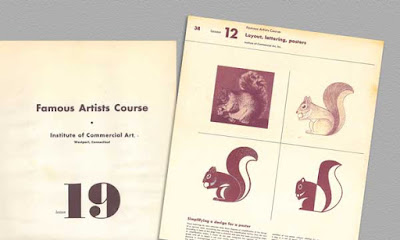
The Famous Artist Course series was a number of giant leather bound art instruction books printed way back in 1950 by the Institute of Commercial Art. They featured the artists Ben Stahl, Norman Rockwell and Albert Dorne just to name a few. Their offerings of instruction always hit the nail on the head. Little has changed in what makes a composition great.

What I really enjoy about these books is the tabloid size (lots of info) and the insight I get into what it was like to be a commercial artist in the 1930s and 40s. Albert Dorne gives us a glimpse at just what it was like to be an illustrator in the U.S. advertising
 world during the height of the Mid-Century Modern movement.

Composing an Advertising Picture
The composition was one of a series of advertisements appearing for American Airlines Airfreight which appeared in national magazines. The story concerned a golf ball manufacturer who found himself trapped by serious production problem. A nearby source which had long supplied vital centers for these balls was unable to maintain delivery schedules and any delay in production might mean the golf ball maker would be “in the red” instead of “on the green.”

The problem was to show the golf ball manufacture in trouble and still tie the story up with the game. As the entire series of advertisements was in a humorous vein, it was decided to picture the businessman in a sand trap — which, of course, represented trouble. The copy in the advertisement explained how American Airlines Airfreight helped the business man out of his difficulty.


The first attempt was too static. The centered figure and the horizon cutting the composition in half was much too dull. The caddy is too prominent!


In this next effort everything was pushed to one side leaving a lot of uninteresting space on the right. The caddy seems to be holding up the picture with his head.


A three-quarter view of the main figure (above) was tried for interest but it did not help. However, our landscape pattern begins to look a bit more interesting although 
the line defining the trap is drawing our attention to the lower corner.

Turning the figure towards the observer (left) adds interest but he is now back in the center of the picture area. This, along with the fact the landscape pattern is creating tangents, spoils the try. However the slope of the trap itself begins too suggest trouble.


Taking a cue from the last sketch, we try a violent design with the golfer in a more exciting attitude. This try is getting somewhere, although the extreme angle of the trap suggests a mountainside rather than a trap. There is trouble in the corners here again.


Lowering the line of the trap and avoiding corners, we are now beginning to get some semblance of unity. Note that our golfer is now in the visual center of the composition. 
The brief case and the caddy are still badly planned.


Shifting the brief case a little gives us a better balance. However, the straight part of the.trap line on the right gives a feeling that everything is about to slide through 
the bottom of the picture. The caddy still appears to be in the wrong place.


In this new position, the caddy now balances the golfer. Note how changing the line 
of the trap so that it swings entirely around the bottom of the picture 
has unified the entire composition.

Final composition. This is the finished composition. By adding some cloud shapes 
and suggesting the flying sand, we tie the caddy and the golfer together. 
We are now ready too make the finished drawing.