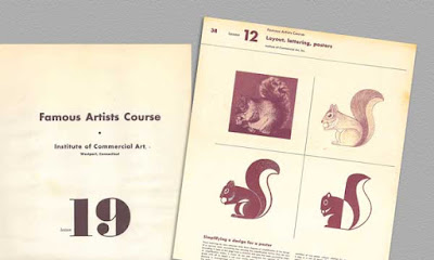
What I really enjoy about these books is the tabloid size (lots of info) and the insight I get into what it was like to be a commercial artist in the 1930s and 40s. Albert Dorne gives us a glimpse at just what it was like to be an illustrator in the U.S. advertising world during the height of the Mid-Century Modern movement.
Composing an Advertising Picture
The composition was one of a series of advertisements appearing for American Airlines Airfreight which appeared in national magazines. The story concerned a golf ball manufacturer who found himself trapped by serious production problem. A nearby source which had long supplied vital centers for these balls was unable to maintain delivery schedules and any delay in production might mean the golf ball maker would be “in the red” instead of “on the green.”
The problem was to show the golf ball manufacture in trouble and still tie the story up with the game. As the entire series of advertisements was in a humorous vein, it was decided to picture the businessman in a sand trap — which, of course, represented trouble. The copy in the advertisement explained how American Airlines Airfreight helped the business man out of his difficulty.
The first attempt was too static. The centered figure and the horizon cutting the composition in half was much too dull. The caddy is too prominent!
In this next effort everything was pushed to one side leaving a lot of uninteresting space on the right. The caddy seems to be holding up the picture with his head.

A three-quarter view of the main figure (above) was tried for interest but it did not help. However, our landscape pattern begins to look a bit more interesting although
the line defining the trap is drawing our attention to the lower corner.
Turning the figure towards the observer (left) adds interest but he is now back in the center of the picture area. This, along with the fact the landscape pattern is creating tangents, spoils the try. However the slope of the trap itself begins too suggest trouble.
Taking a cue from the last sketch, we try a violent design with the golfer in a more exciting attitude. This try is getting somewhere, although the extreme angle of the trap suggests a mountainside rather than a trap. There is trouble in the corners here again.
Lowering the line of the trap and avoiding corners, we are now beginning to get some semblance of unity. Note that our golfer is now in the visual center of the composition.
The brief case and the caddy are still badly planned.
Shifting the brief case a little gives us a better balance. However, the straight part of the.trap line on the right gives a feeling that everything is about to slide through
the bottom of the picture. The caddy still appears to be in the wrong place.
In this new position, the caddy now balances the golfer. Note how changing the line
of the trap so that it swings entirely around the bottom of the picture
has unified the entire composition.
Final composition. This is the finished composition. By adding some cloud shapes
and suggesting the flying sand, we tie the caddy and the golfer together.
We are now ready too make the finished drawing.


