Wednesday, July 15, 2015

Restored Retro Masterpieces - The Kennedy Photography

A rest on the campaign trail unnoticed before fame.
An incredible exhibit that any retro art lover would enjoy is currently on display in Philadelphia. Oddly enough, this show (which runs through early September) is not in a traditional spot but at the National Constitution Center’s Newseum. Creating Camelot: The Kennedy Photography of Jacques Lowe rolls out more than 70 intimate photographs and historic images of President John F. Kennedy and his family. The Newseum presents a retro extravaganza of photos that helped create the legend of the his presidency often referred to as “Camelot” (one of his favorite broadway musicals). 

Bobbie unhappy with the LBG as running mate decision.

The exhibit is full of wonderful black-and-white shots of JFK in action with a behind-the-scenes look at his daily challenges on the campaign trail and in the White House. Even further amazing is an entire room devoted to Jackie and her magazine covers. Stunning large color reproductions and the original magazines they appeared in are on display. What’s even more incredible is that these enlargements were not produced from traditional negatives but from the retouched contact sheets. 

They had to remove Lowe's grease pencil markings as well!

After the Kennedy work was done, Jacques Lowe moved on to further his career in photojournalism and he knew these negatives were a treasure for safe keeping. Thinking it was best to protect them, he did just that — put them in a safe — a safe in JP Morgan’s seemingly impregnable vault in Tower 5 of New York’s World Trade Center. Then 9/11 came and his life’s most important work went with it. Amazingly, the safe in which they were stored was found intact, but the contents of over 40,000 negatives were reduced to ash. There were however, 1,500 of Lowe’s contact sheets located elsewhere in New York, and that’s how the story of this marvelous exhibition begins. 

Retouched print at right.

If you know traditional photography and how scratchy and tiny these prints are (proofs made from the negatives placed directly on paper), you can understand how difficult it must have been to get them to museum quality. There’s a video at the show which explains the process and a huge light table where you can zoom in on all the contact sheets beyond the retouched enlargements displayed. Retro art lovers should not miss this highly under publicized show. A great day trip to spend a afternoon with the Kennedy’s.

Friday, June 26, 2015

The Master Craftsman of the Psychedelic Poster

Wes Wilson and the Psychedelic Poster


I was just a little guy when Bill Graham had those amazing concerts at the Fillmore West, but I was enthralled by the look of those posters. I stumbled across this cover on my iPad from my one of my unread issues of a recent Rolling Stone (RS, June 4). Wes Wilson is still turning out art at 77 years young, semi retired and living on a farm in southwestern Missouri. Commemorating the 50th anniversary of the surviving members of the Grateful Dead, Rolling stone thought it would be appropriate to have Wilson create this retro masterpiece. He said “ I was a one-man operation” and was always kept busy. There was always a concert at the Fillmore! 


The poster offers people the promise of beauty that is ultimately accessible to all, but the history of the modern poster hardly covers two centuries. The beginning is connected with the invention of the lithograph in 1796 by the Bavarian Alouise Senefelder, and further improvements in this technique created by the development of chromolithography. During the second half of the 19 century, the treatment of colors in the photography was greatly improved in Boston, (the home base to a major school of chromolithography), which began an unprecedented flood of these wonderful colored images spread over in billboards and packaging for the most of the globe. 


The psychedelic posters produced in San Francisco between 1966 and 1968 could be compared to the psychedelic trip itself, an instant reflection of contemporary Western culture, loaded with messages turned and twisted for the movement it represented. The music, the drugs, and alternative lifestyles all played a part, but the undeniable power of these posters demands to be observed.

There is unanimous agreement on the importance of the work by the legendary artists known as the Big Five-Wes Wilson, Victor Moscoso, Rick Griffin, Stanley Mouse and Alten Kelly whose posters were mainly produced for concert promoter Bill Graham at the Filmore Auditorium opened in December 1965 and followed by the Fillmore West in mid 1968, as well as a few hundred other notable San Francisco venues such as the Matrix and the Winterland. 


We also know that the psychedelic posters were almost always hand-lettered and even though the text have been based on existing typefaces of that era, the compositions were truly organic and made much greater use of color contrast that has ever been seen before. It must be assumed then that one would have to have had an LSD experience to produce these vibrating works of art.

Wes Wilson is probably the best known of the big five. His dreamy rock posters helped define the look of the San Francisco rock scene. But it didn’t start that way. His poster produced for the Beatles at candlestick Park in late August 1966 show nothing of the route he would partake in his future work. The text for this poster is highly readable and the passages in his psychedelic concoctions in the future that one would have difficulty reading had yet to be introduced. In his posters of the late 60s and early 70s Wilson uses a softening of the letter forms built up upon asymmetric curves and counter curves. Certainly the influences came from Art Nouveau, but the color sense is a lava lamp of LSD excitement.


Psychedelic rock included phenomenal light shows, with slide projections and strobe lights that were intended to kick in the sensory experience of LSD or mescaline. It is impossible to understand the Utopian vision of the psychedelic era without considering the role of drugs. Timothy Leary’s book The Politics of Ecstasy published in 1968, was well in sync with the findings of Dr. Humphrey Osmond, the author of the studies he made on the use of LSD and mescaline as a treatment for schizophrenia. In an article in Look Magazine in September 1959 none other than Kerry Grant spoke out about a successful treatment with the drug. The posters created in the 60s psychedelic movement with swirls and spirals and clashing complementary colors were a clear reference to LSD participation.


The psychedelic movement was quick to disappear and in the spring of 1967. Wes Wilson discontinued his work for Bill Graham (he noted for financial reasons). In October of that year, and anarchist performance group called the Diggers put together a well publicized San Francisco parade to parody a funeral that they entitled “Death of the Hippie Son of Mass Media”. 

The hippie, as well as psychedelic poster art, had died. The organic curvilinear letter forms like the ones seen on the “Are You Experienced” Jimi Hendrix album cover would be replaced by the memorable sparse design done by Richard Hamilton in 1968 for the Beatles White Album.

Were the 60s psychedelic artist-stoned out tripsters or poster design geniuses? Stoned out or not, the big five artists were master craftsman, geniuses of color and composition that provided an invaluable reference to a culture that is still looked upon with enthusiasm by the younger generation of artists today. They did not copy the Masters of the Art Nouveau movement, but brought their own modern sense of originality that reflected the world around them. 


Wednesday, April 15, 2015

Scrapbooking and John Wilkes Booth


The decades 1860 until 1890 were an exciting period for Victorian graphics. With the advent of the Industrial Revolution and the invention of chromolithography the popular market became flooded with meticulously drawn colorful images published by Louis Prang (L. Prang and company).

Scrap booking was hobby started in 1860 as the narrative of the Victorian era was closely linked to the illustrations on these cards. Prangs images of children, wild flowers, animals and birds spoke of the era's love for traditional values. Collecting these printed bits and cards became a popular pastime. The term "scraps" used by the collectors of these colorful printed treasures engendered the term "scrapbook." 

When a fellow professor wandered into my bookmaking class at Moore College of Art and Design he was amazed at how my love of these old postcards had me practically wetting my pants during my lecture on the development of lithography. Prang was a master printer and producer of the holiday cards I had collected (and shown) over my many years as a graphic designer and I think I had my students on board with their beauty.

The following week he presented me a scrapbook that he found in his grandmother's garage.
It was indeed an authentic book dating back to Abraham Lincoln's time!

I was further amazed at the article pasted on one of the pages in the book.
It contained a newspaper article on John Wilkes Booth dating the day after president Lincoln was assassinated.

In honor of today's date in history-the passing of the great president Abraham Lincoln-I have the scan of that scrapbook page posted here.

A thrill to a history buff like myself and I hope to fellow retro art and history buffs out there!


Below is a letter from the Smithsonian Archives and a link to the full account of the event-

"[April] 15th. We were awakened this morning by an announcement which almost made our hearts stand still with consternation. The President was shot last night in the Theater. When the morning paper was issued he was still alive although little or no hopes were entertained of his recovery but now the tolling bells tell us he has ceased to breathe. He is dead. Mr. De Bust has just told Hannah he died at ½ 7 o'clock. Deeply must the country mourn this death for although uncouth & ungainly he was true hearted, magnanimous and kind and in the present crisis ready to follow the such a course with the defeated belligerants as would win them back to their allegiance to the Government and subdue the rebellion in their hearts as well as subjugate their aims. The South has lost in him a good & judicious friend."


http://siarchives.si.edu/history/exhibits/stories/death-abraham-lincoln-april-15-26-1865

Monday, January 26, 2015

Lucian Bernhard and the Plakatstil Poster

Those Amazing Plakatstil Posters!

Hans Rudi Erdt
When we look at retro posters there can be no more of an amazing story than what happened to a 15 year old in 1898 Berlin Germany. His name was Lucian Bernhard and after attending an exhibition of interior decoration he was amazed by the lavish colors he had experienced throughout the show.

Dumbstruck with enthusiasm for these avant-garde colors, Lucian decided to paint his father’s home interiors in the bright paints he was so moved by. His father, retuning from a three-day trip was shocked at what Lucien had done. Not amused, his father named his son a criminal causing young Lucian to flee his home.


Trying desperately to support himself on his own, this self-taught young artist eventually decided to enter a poster contest for Priester matches in 1905. The original poster design was an ashtray with lighted cigar and a box of matches on a tablecloth. Lucian eventually felt the image was too bare and he painted dancing girls in the background rising out of the smoke. Further examination later that day, he decided that the image was too complicated so he painted the girls out. Even later that evening a friend dropped by and asked if it was a poster for a cigar. That motivated Bernhard to paint out the cigar. The young artist also decided that the tablecloth and ashtray stood out to prominently and painted those out as well.

What was left? Just matches a on bare table. With time running out on the contest deadline Bernard quickly painted the word Priester above the matches in blue and got the poster off to the competition that needed to be postmarked by midnight.

The poster and advertising in general was about to have a ground breaking change. The story gets even more amazing! It was eventually leaked out that all of the entries were first thrown in the trash and completely rejected by all the jurors. If one of the group had not arrived late the history of poster design would have been quite different. Ernst Growald of the Hollerbaum and Schmidt lithography firm convinced the jurors that one of the designs in the trash was worthy of reconsideration. Holding up Bernhard’s poster Growald lectured the group,
“This is my first prize. Here is a genius!”

The design went on to become the famous Priester matches poster which was a formula that would be repeated many times over. A simple, direct reduction of shapes and a word. A design approach that is still used with the advantage of running as tiny as a postage stamp and as large as a billboard. This design school of flat shapes and simple color became known as the Plakatstil (poster style) of Germany in the early twentieth century.


Bernhard used this approach in next two decades of his career. He designed over 300 packages for the firm and influenced five other graphic designers to come on board with them. What followed was an amazing array of product logo posters that eventually made its way to America in 1923. Oddly enough, it was five years before he received any poster commissions. No doubt German poster art would eventually play a significant role in the language of American advertising.


Saturday, August 3, 2013

The Circus Poster & P.T. Barnum's Genius


My father was a clown. No, I’m not saying he was just funny –– he really was a clown. A member of the Clowns of America, there are pictures tucked away in my basement of him clowning with Washington dignitaries: George Bush senior, George McGovern, and Walter Cronkite just to name a few (see end). Circus posters were a big part of his studio that included props and puppets of all kinds. No wonder my love for Barnum and Bailey Circus paraphernalia continues to this day.


Behind all of those beautiful lithographic posters he collected was the genius of P.T. Barnum. If one can view American literature starting with Mark Twain (and Huckleberry Finn) then it could also be argued that American advertising starts with P.T. Barnum’s extravagant promotions.


Looking at some of these outrageous Victorian circus posters, I think we can all agree that Barnum was the Shakespeare of early advertising. His slogans and imagery are still capturing the attention of modern consumers in our current media. Whether on the Internet, junk mail, radio or magazines –– the spirit of P.T. Barnum still exists.


Barnum understood that to publicize an event a little story was needed to get the public convincingly under the big top. And that story was all Barnum. He well understood it was what you said about an event that made it valuable. The "word's most terrifying living creature!" (below) or "The strongest woman that ever lived!" (above). These are all part of the masterful deceptions brought forward for the first time in American advertising by Barnum.


Out of the circus came the sideshow and this sideshow was where Barnum blossomed.
In 1841 he purchased a five-story factory on Broadway just north of the battery in New York. Here he crafted his stories for the selling of oddities from the strange to questionable. The sophisticated Victorian consumer of New York bought into it big. Barnum’s rhinoceros was advertised as a "unicorn" and the “Beaumouth of the Scriptures” was the first hippopotamus seen in the States. The public ate it up.


The posters here demonstrate how Barnum & Bailey left us with a legacy of colorful phrases that still are major part of commercial advertising. If you use the word "jumbo" to describe size, you can thank Barnum’s genius behind his "Jumbo" the elephant. 


If you’ve seen enough late-night television commercials you've heard the catch phrases the he created:

We are closing our doors forever!

Don’t miss this once-in-a-lifetime opportunity!

All items must go!


These are the masterful deceptions of P.T. Barnum which eventually branched out overseas with his Greatest Show on Earth (below).


How did it all start? As a young man Barnum clerked in the local merchandise store in the small town of Bethel Connecticut. It was here that he discovered his best success –– lottery tickets. As Barnum stated, “you don’t sell the ticket, you sell the dream.” His lottery business became the largest supplier of lottery sales in New England. 


The traveling circus at the turn of the 20th century was an anticipated event across all of America, and the Barnum & Bailey circus parade was big. So big that towns closed their schools and businesses declaring a local holiday to celebrate their arrival. More to come on these fantastic shows, and how posters announcing these enormous events played a big part in their success.

Dad (left) with Walter Cronkite at the Circus Saints & Sinners Club

Tuesday, April 16, 2013

Toulouse-Lautrec and Jules Cheret. Who's the true master of the early poster?


It's the late 19 Century and poster art was in early stages of development through the art Nouveau or "new art" movement in Paris. With the help of Jules Cheret and Henri de Toulouse-Lautrec the poster became the most popular form of mass advertising. Cheret began drawing his pictures directly on to the lithographic stone right after the mechanical presses were invented. It was the first time in history that these images could be produced so abundantly and cheaply that their posters populated streets corners of Paris on every available surface.

 
Lautrec dresses up as an alter boy for friends wedding.


For Henri de Toulouse-Lautrec the timing of this lithographic mecca couldn’t have been more perfect. Often known for dressing up in outrageous outfits, Henry’s reasons for preferring to use the medium was obvious. What better to attract the attention of the public’s eye? The poster was that perfect–in your face medium–that accomplished these goals.


History books have often overlooked Jules Cheret's contribution to the development of the early lithographic poster. Oddly enough, he had been given the first commission for the Moulin Rouge when it opened in 1889, but his pretty approach with circus riders on donkeys was not a successful brand for the nightclub–somewhat invested in the acceptable debauchery at the time. While Henry has gone on record as an admirer of Cheret’s efforts, only a few months later it was Cheret who would proclaim, “Lautrec is a master!”


Graphic design art historian Phillip Meggs raised an important question on how we might have overlooked Lautec’s contemporaries and their contributions in his article Toulouse Latrec: Superb but Not Alone. He asks the question- ”Was Henri Toulouse-Lautrec the guru of the modern poster as some art history books would have us believe? Or was he the quick sketch artist storming into the print shop with a hangover and using his brilliant gifts as a draftsman to bang out posters?” - AIGA Journal of Graphic Design Vol.4, No. 2, 1986.

So who really is the master of the first advertising poster? More to come. We're not done yet!


Friday, December 2, 2011

The Polish Poster


If you know your World War II history well enough you'll remember that Poland got slammed on both sides. First, by a devastating invasion by Hitler from the West (with no real declaration of war), and second, only seventeen days later, by the Soviets on the East.The capital city of Warsaw was almost completely gone when all was said and done, and with it went any purpose for great art or design. 

But the Polish people at that time owned a resilience that was unmatched elsewhere, and within that mode of endurance the Polish school of poster art emerged Henryk Tomaszewski who led the drive to promote the art of the Polish poster as a prominent means of communication–a graphic idiom that eventually became a source of national pride. Put in perspective, Poland's electronic media was not even close its neighboring countries who had not been been dismantled by the effects of the war. The poster became the essential leader in communicating events in this communist country for many years.

Another milestone in poster history was in 1964 when the landmark Muzeum Plakatu was dedicated to this rich source of communication of the Polish people post Wold War II. The museum generated international attention and the polish poster exists today as a testament to the will of an entire generation exposed to war.

The hardships these people sustained through the realities of war and beyond continued to show up in their graphics, as the designers of these historical posters wore their hearts on their sleeves. The look of the Polish poster began to take on surreal, emotional and political aspects.

A major trend in polish posters sprung up in the 1960s and reached a high point in the 1970s. A darker more somber side carrying the weight of surrealism and political awareness in a reaction to the social constraints of the dictatorial regime in place was now apparent. The freedom so often denied the Polish nation in history was now becoming a subtle subject appearing in the Polish poster.
Franciszek Starowieyski (left) was the first of the graphic designers to incorporate these frustrations of the Polish nationality into the work of his posters. Surreal and sometimes downright gory, the pictures produced by Starowieski have a tendency to stay with the viewer long after the images have been digested into the human psyche. 

Jan Lenica pushed the imagery even further with a menacing and dreamlike quality of communication that even ventured into animated media. When a young Roman Polanski was asked to name his favorite Polish filmmakers, he cited only two—Andrzej Wajda and Jan Lenica. The first choice was not much of a surprise, but to single out Jan Lenica, a comparatively obscure animator, must have seemed a little puzzling. Lenica is probably best known in for his poster artwork for Roman Polanski's films for the Compton production company, Repulsion (1965) and Cul-de-Sac (1966). Both are childlike gouaches, verging on the abstract, though immediately distinctive. Like Polanski films, Lenica's career in poster art and set-design cultivated associations with the absurd, a preoccupation that culminated with a series of remarkable animations during the 1960s and 70s.

Waldemar Swierzy (below) polished his national style in a graffiti like manner with gestures into the wet paint working with a brush handle and incorporating a variety of media, sometimes incorporating watercolor, pencil and even crayon into one design. In his famous poster for the rock star Jimi Hendrix, this erratic movement with paint and markings bring the natural violence of the Polish poster into a unique vision. As spontaneous as his technique looked, it has been said he has been known to execute a single poster as many as five times before releasing the final.These designers carried a unique personal vision prompting others to join them in what became a famous national style that continues today.
Waldemar Swierzy


Can you think of any other examples where the poster arts have moved the masses?

Comment and we'll post all at the Retro Art Club.

Submit art to (KevinMyersDesign@gmail.com).

Saturday, October 29, 2011

The Retro Billboards of the 30s

A Look Back to When Advertising Hit the Roadways.


My favorite part in the movie Back to the Future is when Marty McFly––after time traveling back to the early 1950s––figures he needs to be a little discreet and hides his DeLorean behind a period replica of a billboard. Director Steven Spielberg creates a perfect retro environment that was both believable and amusing for its quaint appeal, as he sets up this time period using the popular gasoline billboards of the day.


How did these outdoor cathedrals of advertising become a part of the American way?
In the 1930s, as a part of the national recovery act, the federal government's make–work programs such as the Works Progress Administration (WPA) federally funded a plethora of projects that opened up work for artists. Automobiles and roads for their use were developed simultaneously, and the marketing potential for roadside advertisements grew almost overnight.


Parkways were created for leisure driving, and this led to a paved road system. For a long time, the poster was the effective outdoor advertising to pedestrians, but now the motorway billboards were the new rave in the marketing of open spaces. These new marketing monuments showed up in urban, suburban, and even rural areas, providing work for artists to specialize in commercial billboard designs. Painters were now confronted with much larger areas and the simpler the approach the better. Solid color and simplified shapes were commonplace, as the more detailed paintings were far too labor-intensive to produce.

In the 1930s, Americans learned about modern design through advertising. The American Streamline movement was the birth child of European simplicity in design. Their unadorned Modernist applications to industry had been practiced for well over a decade, and completely ignored in America. But the Great Depression changed all that, and the America's mindset was drastically altered by the results of the destitute situation they had been handed. Change became a necessity, and affected all of commercial art––specifically advertising and graphic design. European modernist movements such as Futurism, Constructivism, and the Bauhaus school, were brought to America in books and manuals by the many members who moved to New York and Chicago as a result of very troubling times abroad.


As these movements made their way to American soil, the Streamlined decade began producing a new profession of industrial designers. With this new vision to redesign anything from staplers to airplanes, nothing was left untouched by this modern ethic. It was an ethic modeled after the Bauhaus movement to increase efficiency in all that was antiquated in products broadly ranging from furniture to fashion.

Take a close look at these modern billboards in the 1930s and you can see symbolism of an age of speed and great optimism. The designers of the 1930s cultivated this symbolism with the use of teardrop graphics implying tremendous speed. Advertising agencies describing newly designed automobiles used names symbolizing dynamic power––like the Zephyr, or the Airflow. The Streamline symbols of speed were sharp geometric motion lines and drop shadows. Just as we have witnessed the Star Trek communication device become the precursor to the cell phone in our day, in the 1930s the popular comic book character Flash Gordon spread his heroics using machinery that was also now becoming somewhat of a reality in their modern world.

My wife's mother owned this incredible fan that was handed down from her grandmother. Obviously made in the American Streamline era, it's one that I cherish, for it still works, and is beautifully designed––a functional metal masterpiece. I suggest you keep your eyes open for such treasures in your own great-grandfather's closet. The billboards are gone, but the evidence of the American Streamline movement still remains.


Discussion:
Can you think of other outdoor marketing devices (new or old) that creatively communicates an advertising message to the consumer?

Sunday, May 29, 2011

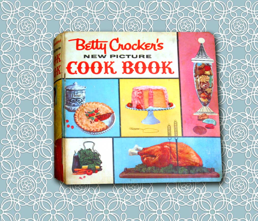
The Betty Crocker Cookbook-A Walk Through the Lifestyles of the 60s.


It has been said that a true reflection of society can not be found in history books or great literature, but in the advertisements and merchandise that it leaves behind.

As I get older, I find it difficult to let go of the retro relics of my parents and grandparents. One would think a mangled old cookbook would've made it into the trash several decades ago. But the Betty Crocker New Picture Cookbook of the 1960s has always been nearby. Not for its recipes— if you're interested in taking a trip down Cholesterol Lane this is the Bible for fatty foods— but for its remembrance of a simpler time.


Of course the 60s were not without their problems, but during the Cold War comfort food was king and in its court was the modern housewife. The 60s housewife was the kitchen magician that could entertain on a moment's notice. As stated in chapter 1 of the Betty Crocker New Picture Cookbook, she knows "how to set an attractive table at meal time”–an art form that has lost its popularity with our mega-fast microwave meals of the 21st century.


And for planning foods that go together, the Betty Crocker New Picture Cookbook of the 1960s offers this poetic advice:

Something soft and something crisp
Should always go together,
And something hot and something cold
No matter what the weather;
Serve bland foods with tangy sauce
And garnish them with green.
If you will use these simple rules
you'll be your family's Queen


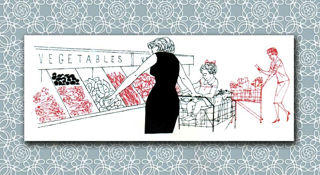
The scarcity of men doing chores (unless he's barbecuing at the grill), is almost comical throughout this book. Nowhere is there evidence of a man in a supermarket. And quite often, he's being greeted at the door or served coffee by his beautiful housewife––always in formal evening attire.


The pictures are so bright and colorful they bear an uncanny resemblance to the Technicolor movies so popular during the day of Ben Hur and the Sound of Music.


The cookbook opens with a section on "kitchen know-how."
You can't help but grin at this advice for the modern 60s housewife:

Refresh Your Spirits
Every morning before breakfast, comb hair, apply makeup and a dash of cologne.
Does wonders for your morale and your family's too!

Think pleasant thoughts while working and a chore will become a “labor of love.”

Have a hobby. Garden, paint pictures, look through magazines for home planning ideas, read a good book or attend club meetings. Be interested–and you'll always be interesting!


All this is delightfully amusing to a freelance designer that has spent his entire career looking through (and creating) magazines, paints pictures, and has done all the cooking in my home for quite some time now.

I'll pass on the makeup and a dash of cologne.
My wife is still the family's queen, she's just that 9-5 (with a good deal of overtime) mom, right here in Good Ole' 2011. It's just my turn to say "Ward something's wrong with the Beaver," when she arrives at the door.

Thursday, May 19, 2011

A retro poster exhibit at the Philadelphia Museum of Art is just what the doctor ordered!


Health for Sale: Posters from the William Helfand Collection, a retro poster exhibit at the Philadelphia Museum of Art, is some powerful medicine for the retro art enthusiast. The William Helfand collection showing 50 of the nearly 200 medical posters he has given to the museum since 1967, is a walk through advertising in its infancy.


Do not be thrown by the topic. These retro posters are rare gems, and a tribute to the enormous talent of the poster artists of the late 19th and early 20th centuries.

On view are the early days of advertising that sought to sell goods on global scale with the only medium available––the lithographic poster. These artists showed remarkable ingenuity in their use of bold imagery and stunning messages alerting the public about deadly diseases that included (what might now seem humorous) warnings about alcohol abuse and the sex orgies resulting from the evils of marijuana use––dating way back to 1936. Who knew cannabis would become medically legal in scattered states throughout our country providing orgies for glaucoma patients everywhere 75 years later!


Included in the presentation are works by the famous poster designer Jules Cherét––a contemporary of Toulouse-Lautrec. Cherét might be overlooked with Lautrec’s popularity, and could be considered a father of the lithographic poster (see Henri de Toulouse-Lautrec guru of the modern poster? September 20, 2010 entry). His posters are colorful free-flowing compositions that could be considered the first form of outdoor advertising ever.


Advertisements for pharmacies and medical conferences can be seen in Chinese, French, Hungarian, Italian, Czech, English, and there’s even a poster promoting Bayer aspirin in––of all things––Indonesian. You might even want to walk away with the fully illustrated publication provided that sheds light on the history behind these well conceived posters that worked sales around the globe with nothing more than bold imagery and powerful text. 

The show runs through July 31 and is free with admission to the museum.

Saturday, April 30, 2011

A Retro Look at the Golden Age of Magazine Design and Alexey Brodovitch


Magazine design from 1930 to 1950 was considered the golden era and Harper’s Bazaar had its king in Alexey Brodovitch. As art director at Harper’s Bazaar, Brodovitch was the straw that stirred the consumer passion for fashion periodicals. A European immigrant, Brodovitch brought his theories on design that were nurtured by his contemporaries overseas––right into the American living room.


Harper’s Bazaar, was as stunning visually as it was in its long running financial success. Two magazines stood out of the crowd of numerous fashion periodicals during the Thirties, Vogue (art directed by M. F. Agha), and Harper's Bazaar (art directed by Alexey Brodovitch from 1934 to 1958). Both were on the cutting edge of design, and leaders of the pack in advertising sales.


At Harper's, Brodovitch introduced a simplified “modern” graphic style that would appeal to the American masses for over three decades, and at the same time, advance an appreciation in modern design through his distinctive approach. Americans learned about modern design through commercial culture, and the social obsession of the age was clothing and fashion. His layouts used aggressive shapes and text blocks that mimicked the photographs. Imaginative cropping and fanning of his photos and text suggested a style that is not about an individual model-but about shape and form.

By 1950, “white space” was the hallmark of the Brodovitch style. It was also a style that now defined fashion as an abstraction, as he implied that the bodies are to secondary to the overall product and design of a page. 


Brodovitch had a plethora of passion for education and played a very active role in the commissioning process, often discovering and showcasing young, unknown talent along the way. His followers were many, and he taught design classes at his home and at the New York’s New School for Social Research. Brodovitch became a masterful influence as he asked the student to search within each problem for the best solution and execution. He was deeply influential not only to his student body, but also on their eventual approach to design.

One of his students, Otto Storch-who would also go on to become a prominent designer-wrote about his classes: “Brodovitch would dump photostats, type proof, color pieces of paper, and someone’s shoelace, if it became untied, onto a long the table together with rubber cement. He would fold his arms and with a sad expression challenge us to do something brilliant.”


Looking at his covers for Harper’s Bazaar one can obviously see a time capsule of the day and an American cultural obsession with fashion. Subject matter aside, they are compositional masterpieces of color, light, and form in a day when covers did not have to be plastered with massive amounts of copy to a lure the consumer to buy off the newsstand.

Brodovitch was a design wizard that could push the product forward to the consumer with a visual beauty that was so far ahead of the commonplace magazine design of his day. As a art director of art and fashion jewelry magazines for over 15 years, I have a special admiration for his masterful solutions, and have used his techniques to move the viewer’s eye away from the model and onto focusing on these art forms.

The Brodovitch style in our era of diminishing page counts, and with that––diminishing white space—is not always a path of designer can implement. But for those who love magazines––it’s a style one hopes will never fade.

Check out my techniques inspired by Brodovitch to make jewelry the key focus of a layout by clicking on the Fashion Book head on my home page - www.flyingblindpuppy.com