Monday, July 30, 2018

Bradbury Thompson - Painting with Type

I often tell my illustration and design students that you can paint with typography. Think of  the blank page as a white canvas. This helps illustrators to understand the importance of type and to explore the dynamic range of the letter-form when combined with an image.


Ultimately, I lead them to look at the work of Bradbury Thompson, who in my opinion, used type as if it was a toy. Over 60 some years of playing with type and image, Thompson’s astonishing talent showed through on almost everything he touched. A vast knowledge of printing gave him the basis for experimentation. 


Thompson worked in printing firms several years before moving to New York. This knowledge led to the experimental designs for Westvaco Inspirations (the iconic graphic design image below). The four color publications demonstrated Bradbury’s love of typography, as he combined plates of art and illustrations borrowed from advertising agencies and museums into a new typographic language. 


Exploring 18th and 19th century engravings as a resource for his designs, he used large bold organic and geometric shapes to bring symbolic power to the page. Details from half-tone reproductions became full page visual patterns and dynamic elements that created movement. 


As an art director, Thompson used old-style typefaces in his work for Smithsonian magazine and ArtNews including many designs for the United States postage stamps. His career also owned a  lucrative flow of book designs including — one of his most impressive – the Washburn College Bible. Some designers have stated that the bible is the most monumental and innovative reassessment of bible typography since Gutenberg’s own edition appeared in 1455. The Bible presented text in cadenced phrases presenting meaning for both the reader and listener that was conveyed through typography and image. Its chapter openings presented beautiful reproductions of paintings and the whole project was some 10 years in the making.


Uniting modern typography organization with historic illustrations, Thompson’s impact on the field of graphic design was marked by many triumphs. He created a new outlook of the possibilities of image with classical type. Often defining himself at times as a teacher, his career as a professor at Yale University lasted for many years. In his words:


“The art of typography, like architecture, is concerned with beauty and utility in contemporary terms. . . the typographic designer must present the arts and sciences of past centuries as well as those of today. . . and although he works with the graphics of past centuries, he must create in the spirit of his own time, showing in his designs an essential understanding rather than a labored copying of past masters.”
From the Westvaco inspirations 206, 1956


Well stated. Look to the past and make it your own in the present!

Thursday, June 14, 2018

The Psychedelic Poster in Black and White?


With all the hoopla surrounded around the beauty and art of the psychedelic poster era one wonders what the poster for a pop concert might look like in the early 60s just before the psychedelic explosion. These posters did not start with the color vibrance that is so popular and well-known today. The pre-color early 60s poster artists used numerous design techniques based on the French Art Nouveau poster. Surfaces were often broken with multiple framing devices. There was abundance of classical printers ornaments, rules and stars, as well as, for the typography, variations in font and weight. Unfortunately it was the printers that were most responsible for these early compositions, without a designer on hand, these printers remain anonymous.


In the 1960s the use of exaggerated typography was widespread, featuring layouts based on the horizontal bands, sometimes featuring black-and-white photos if they were available.

The first true rock periodical was Rolling Stone and in its early years was printed only in black and white. The popularity of these typographic treatments grew through Jan Wenner’s publication without color. Here we can focus on the hand lettering that tended toward a great organic unity of composition, and made a much greater use of typographic impact only in black-and-white. Looking at these posters with this mind set will show you how truly extraordinary these designs were.


Thus began the design of the “slow” poster whose message required an unusually long time to figure out. Later these posters reach their peak with the color additions in the work of Wes Wilson and Victor Moscoso. The very earliest examples of psychedelic posters do not yet display their quality. 


We find the poster known as “The Seed” that many experts of this movement considered to be the first psychedelic poster. The promotion advertises concerts by the Charltons held in the first two weeks of June 1955 at the Red Dog Saloon in Virginia City which was a small town in Nevada. Designed by two members of the Charlatans, George Hunter and Michael Ferguson it was was printed only in black. The poster picks up look of the wild West posters of the 19th century medicine shows or traveling circuses prevalent during this period. These hand-drawn techniques were not quite yet the organic styles that were to evolve a few years later but were the spring board that would adapt to the combination of typography in color and photography with the work by the legendary artists of the psychedelic era known as the big five. They are: Wes Wilson, Victor Moscoso, Rick Griffin, Stanley Mouse and Alton Kelly.


We must admit that even though the text might have been based on existing typefaces of that era, the compositions were truly organic, and these artists made a much greater use of color contrast that has ever been seen before in the history of graphic design. We also must recognize then that one would have to have had an LSD experience to produce these vibrating works of art. Stoned out or not, the big five artists were master craftsman, geniuses of color, and compositional wizards that provided an invaluable reference to a culture that is still looked upon with enthusiasm by the younger generation of artists today.


They did not copy the Masters of the Art Nouveau movement, but brought their own modern sense of originality that reflected the world around them.

When I was a very little kid my best friends brother did attend Woodstock. I know he was there–because he couldn’t remember anything about it either. He did, however, come back with one hell-of-a poster!


Thursday, April 26, 2018

The Private Path of Herbert Matter

Zurich and Basel were the home of several influential design schools, publishers, and printers in the 1930s, and Switzerland became a central focus for graphic designers from many countries in Europe. Some historians have noted that this was largely due to the pressures and imposed restrictions of National Socialist policy. Regardless, many Swiss-born designers developed their own distinct influential styles.


One most notable in the history of graphic design was Herbert Matter. Born in 1907 in Engelberg, Switzerland, Herbert Matter was fortunate with a great start as a young artist. He studied painting in Paris attending the Academie Moderne under the tutelage of the popular artist Fernand LĆØger. It was with this instruction that Matter crafted his unique style as he was encouraged to expand his artistic horizons.


But there was much more than this to feed his development as an artist. As chance would have it, Herbert found a camera left in the Paris apartment where he was staying as a young painting student. He began to take pictures and became quite adept at working this new tool. No doubt, without this turn of events the world might not have experienced this life long advocate of experimentation. With his new found Rollei camera he had found both a design tool and an expressive form. Matter did not apply himself to a single school or artistic approach but took his own path away from the academia and trends of his time. At this point in his young career his vision came only through the aid of his camera. 


Matter was fascinated the photograms seem here done by the master of the Bauhas - LĆ”szló Moholy-Nagy. Perhaps this led him to the magic of collage and montage—-both worked ingeniously as his favored modes. He held his inspiration from El Lissitzky and Man Ray both very popular during his development as an artist.


The legendary and highly awarded designer Paul Rand stated “Herbert’s background is fascinating and enviable, “He was surrounded by good graphics and learned from the best.”  

In 1929, he was hired as a designer and photographer for the legendary Deberny and Piegnot. Assisting A.M. Cassandre an established (and well known) art director, he began to inherit the aspects of fine typography.


Matter’s great pictorial imagination set himself out as a new fusion of design intellect in his approach to ads, editorial, fashion and photography.  In 1932 at age twenty-five he returned back home and worked for the Swiss National Tourist Office where he applied photomontage and Modernist techniques to poster design. With this intensive training in the States under his belt, it is not hard to imagine that the famed posters designed for the Swiss Tourist Office soon after his return had the beauty of a Cassandre poster.


Gravure printing, the method commonly used to print magazines, gave his images a photographic grainy quality. Color or hand-tinted images were combined with black and white or tinted monochromes. Matter used unnaturally dark skin tones were to promote the effects of the joys of the sun associated with outdoor sports, while the mono chromatic backgrounds reflected the cooler snow and clear blue skies. The Swiss national color was pure red and this was often used judiciously for text or a highlight in the composition. Most importantly the posters were notable for their extreme contrasts of scale—with large smiling faces photomontaged against mountains and skiers.


In his further development as an artist/designer he began creating covers for Arts & Architecture magazine. These notable designs are his photographic explorations showing a incredible sense of movement. He continued to develop these innovative explorations reducing photographs to symbols and combining images and words in some truly amazing ways. 


Upon his move to the United States Matter soon began taking photographs for Harper’s Bazaar and Saks Fifth Avenue. Later, he joined a the New York photographic studio, “Studio Associates,” located near the CondeĆ© Nast offices, where his illustrative imagination worked covers and inside spreads for Vogue.

As Alvin Eisenman, head of the Design Department at Yale and long-time friend, points out: “Herbert had a strong feeling for minute details, and this was exemplified by the distinguished typography he did for the Knoll catalogues.”


In 1952, he was asked by Alvin Eisenman, head of the Design Department at Yale, to join the Yale faculty as professor of photography and graphic design. 

“He was a marvelous teacher,” says Eisenman. “His roster of students included some of the most important names in the field today.” 

At Yale, he also tried his hand at architecture, designing studio space in buildings designed by Louis Kahn. “He was good at everything he tried to do,” continues Eisenman. 


As one of his former students would state: 

“As a teacher, and in graphic design for clients, he has seldom given less than his whole, for it seems impossible for him to create anything casually. Rich in range and quality, his work is completely original.”


In 1960, he started photographing the sculpture of Alberto Giacometti which Matter continued to work on for 25 years. In 1978, he had received a Guggenheim Foundation Fellowship for photography in 1980. In 1983 he received AIGA Medal of Recognition and left us with a legacy to remember as he passed only one year later in 1984.


Wednesday, April 4, 2018

Artist Paul Rand Speaks


A highly influential twentieth century American graphic designer and art director, Paul Rand brought his informal approach to organizing space (often referred to the New York School) to the U.S. from abroad. 


A highly influential twentieth century American graphic designer and art director, Paul Rand brought his informal approach to organizing space (often referred to the New York School) to the U.S. from abroad. Rand’s iconic corporate logo designs for major firms, included IBM, ABC, Morningstar, Inc., NeXT Computer, Yale University and (unfortunately) Enron.


In 1937 Paul launched his first career at Esquire magazine creating a spectacular series of covers for Apparel Arts a quarterly publication in conjunction with the popular magazine.
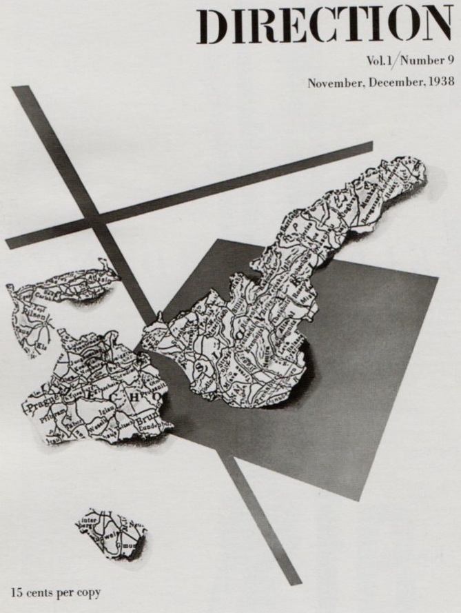
He also managed his time to art direct and create an impressive array of covers for other magazines, particularly Direction. 


It’s obvious when we look back at these retro designs that Paul Rand’s covers broke with the tradition of American magazine design. This cemented his legendary status. From 1938 on, his work was a regular feature of exhibitions of the Art Directors Club and in 1972 he was inducted into the New York Art Club Hall of Fame.


Paul Rand was perhaps best known for ushering in the Modern approach to graphic design. His design experience has paralleled the development of modern design movements:
• Media promotion and cover design ran from 1937-1941
• Advertising design 1941-1954
• Corporate identification 1954 on


Collage and montage were often his tools in developing his designs for books and advertisements. His work echoed the likes of the Cubist, the Bauhaus and Constructivist movements.


“The composition for this is based on a cross, a plus sign. The plus sign has merit in itself: It’s a positive sign. It’s that convincing aspect of geometry. You can’t criticize geometry. It’s never wrong, It’s based on reality,”

Ad for the Container Corporation of America


“This was one of about four or five ads I did for the company’s “Great Ideas of Western Man” series. It was actually done on a piece of decayed wood. It was not a photograph. I presented the design on a piece of wood with a real nail going through the photostat of the imprint, and then it was photographed by the printer.”

“The Etruscans painted portraits of people who were dead on pieces of wood and used them as grave markers. It was these paintings that generated this idea. The stare from the face is one of fear, and the paper is nailed over the person’s mouth. So it conveys the idea of what censorship is all about.”


“This kind of design is very much influenced by Picasso’s Cubism, especially the collages that were made. It doesn’t copy anything; Cubism provides the grammar in which to work. 


This stems from the idea of not copying, but actually using the elements as your design.”

Rand believed that type should be utilized to carry a message rather than solely decoration.

H.L. Mencken Book Cover


“It’s one of my favorite covers because Mencken was one of my favorite writers. The photograph was a rather poor representation of Mr. Mencken, but I felt I needed to use a picture of him. What do I do to take this out of the doldrums and make a good photograph out of a bad one?,” I asked myself. 


"I decided to incorporate the idea of what he did. He was always making pronouncements and lecturing and criticizing. I thought this attitude of holding his hand up with a threatening finger would be nice way of expressing who this guy was. The way this thing was cut out tells you something about him that face alone would not tell you. The lettering being so fine and delicate, is in contrast to the representation of the whole composition, which is rather bold.” 

You said it Mr. Rand, my mantra for my design students is good design is contrast.

See my favorite for design classes with Paul Rands view on the essential elements of art - 
https://www.shortoftheweek.com/2009/03/27/paul-rand-film/

Tuesday, January 30, 2018

The Retro Posters of World War I


The World War I posters produced by Germany and Austria-Hungary were quite different than their opponents of the allied forces of France, Russia and Great Britain (with the US joining in 1917). The simplicity of the Plakatstil with words in bold and images broken down into simple shapes was a good fit in integrating that movement into war propaganda.


However, there were still some components still carried over from the Vienna Secession.
The popular British war poster of the time stressed the need to promote values, the home and the family.


The most effective of the lot was the commonly copied poster by Alfred Leete was the popular Lord Horatio Kitchener, British Secretary of War pointing directly at the viewer. 
This powerful face forward illustration originally appeared as the cover of London Opinion magazine September 5, 1914 and was carried above the headline “Your Country 
Needs You.”


Perhaps the most sentimental of the lot was my personal favorite, Saville Lumley’s ad “Daddy, What Did YOU do during the Great War?” Nothing could have promoted more guilt and cowardice than the question presented by a young child. The chap gazes off in complete embarrassment!


The United States advertising effort promoted the war to “make the world safe for democracy” in “the war to end all wars.” The Division of Pictorial Publicity was set up to promote the cause and illustrator Charles Dana Gibson became their art director. The agency produced as many as seven hundred posters and numerous propaganda materials. This all had a pronounced effect on the field of illustration as many commercial artists turned to poster design.

A good number of illustrators gained fame from the persuasive propaganda they depicted. The sketchy style of James Montgomery Flagg produced 46 posters through the entire participation of the US in the war. He is most known for his Americanized version of the Kitchner pose, which was in fact a self portrait (above are the many versions still popular and in use today).


The Artist Joseph C. Leyendecker was the most popular of the group following Gibson who created the idealized Gibson girl in anything from Navy suits to Army gear with the slogans “GEE I WISH I WERE A MAN. I’D JOIN THE NAVY.” It was a far cry from our next war and the appearance of Rosie the Riveter!