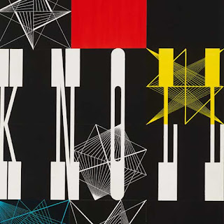
Zurich and Basel were the home of several influential design schools, publishers, and printers in the 1930s, and Switzerland became a central focus for graphic designers from many countries in Europe. Some historians have noted that this was largely due to the pressures and imposed restrictions of National Socialist policy. Regardless, many Swiss-born designers developed their own distinct influential styles.
One most notable in the history of graphic design was Herbert Matter. Born in 1907 in Engelberg, Switzerland, Herbert Matter was fortunate with a great start as a young artist. He studied painting in Paris attending the Academie Moderne under the tutelage of the popular artist Fernand Lèger. It was with this instruction that Matter crafted his unique style as he was encouraged to expand his artistic horizons.
But there was much more than this to feed his development as an artist. As chance would have it, Herbert found a camera left in the Paris apartment where he was staying as a young painting student. He began to take pictures and became quite adept at working this new tool. No doubt, without this turn of events the world might not have experienced this life long advocate of experimentation. With his new found Rollei camera he had found both a design tool and an expressive form. Matter did not apply himself to a single school or artistic approach but took his own path away from the academia and trends of his time. At this point in his young career his vision came only through the aid of his camera.
Matter was fascinated the photograms seem here done by the master of the Bauhas - László Moholy-Nagy. Perhaps this led him to the magic of collage and montage—-both worked ingeniously as his favored modes. He held his inspiration from El Lissitzky and Man Ray both very popular during his development as an artist.
The legendary and highly awarded designer Paul Rand stated “Herbert’s background is fascinating and enviable, “He was surrounded by good graphics and learned from the best.”
In 1929, he was hired as a designer and photographer for the legendary Deberny and Piegnot. Assisting A.M. Cassandre an established (and well known) art director, he began to inherit the aspects of fine typography.
Matter’s great pictorial imagination set himself out as a new fusion of design intellect in his approach to ads, editorial, fashion and photography. In 1932 at age twenty-five he returned back home and worked for the Swiss National Tourist Office where he applied photomontage and Modernist techniques to poster design. With this intensive training in the States under his belt, it is not hard to imagine that the famed posters designed for the Swiss Tourist Office soon after his return had the beauty of a Cassandre poster.
Gravure printing, the method commonly used to print magazines, gave his images a photographic grainy quality. Color or hand-tinted images were combined with black and white or tinted monochromes. Matter used unnaturally dark skin tones were to promote the effects of the joys of the sun associated with outdoor sports, while the mono chromatic backgrounds reflected the cooler snow and clear blue skies. The Swiss national color was pure red and this was often used judiciously for text or a highlight in the composition. Most importantly the posters were notable for their extreme contrasts of scale—with large smiling faces photomontaged against mountains and skiers.
In his further development as an artist/designer he began creating covers for Arts & Architecture magazine. These notable designs are his photographic explorations showing a incredible sense of movement. He continued to develop these innovative explorations reducing photographs to symbols and combining images and words in some truly amazing ways.
Upon his move to the United States Matter soon began taking photographs for Harper’s Bazaar and Saks Fifth Avenue. Later, he joined a the New York photographic studio, “Studio Associates,” located near the Condeé Nast offices, where his illustrative imagination worked covers and inside spreads for Vogue.
As Alvin Eisenman, head of the Design Department at Yale and long-time friend, points out: “Herbert had a strong feeling for minute details, and this was exemplified by the distinguished typography he did for the Knoll catalogues.”
In 1952, he was asked by Alvin Eisenman, head of the Design Department at Yale, to join the Yale faculty as professor of photography and graphic design.
“He was a marvelous teacher,” says Eisenman. “His roster of students included some of the most important names in the field today.”
At Yale, he also tried his hand at architecture, designing studio space in buildings designed by Louis Kahn. “He was good at everything he tried to do,” continues Eisenman.As one of his former students would state:
“As a teacher, and in graphic design for clients, he has seldom given less than his whole, for it seems impossible for him to create anything casually. Rich in range and quality, his work is completely original.”
In 1960, he started photographing the sculpture of Alberto Giacometti which Matter continued to work on for 25 years. In 1978, he had received a Guggenheim Foundation Fellowship for photography in 1980. In 1983 he received AIGA Medal of Recognition and left us with a legacy to remember as he passed only one year later in 1984.


No comments:
Post a Comment