Friday, December 2, 2011

The Polish Poster


If you know your World War II history well enough you'll remember that Poland got slammed on both sides. First, by a devastating invasion by Hitler from the West (with no real declaration of war), and second, only seventeen days later, by the Soviets on the East.The capital city of Warsaw was almost completely gone when all was said and done, and with it went any purpose for great art or design. 

But the Polish people at that time owned a resilience that was unmatched elsewhere, and within that mode of endurance the Polish school of poster art emerged Henryk Tomaszewski who led the drive to promote the art of the Polish poster as a prominent means of communication–a graphic idiom that eventually became a source of national pride. Put in perspective, Poland's electronic media was not even close its neighboring countries who had not been been dismantled by the effects of the war. The poster became the essential leader in communicating events in this communist country for many years.

Another milestone in poster history was in 1964 when the landmark Muzeum Plakatu was dedicated to this rich source of communication of the Polish people post Wold War II. The museum generated international attention and the polish poster exists today as a testament to the will of an entire generation exposed to war.

The hardships these people sustained through the realities of war and beyond continued to show up in their graphics, as the designers of these historical posters wore their hearts on their sleeves. The look of the Polish poster began to take on surreal, emotional and political aspects.

A major trend in polish posters sprung up in the 1960s and reached a high point in the 1970s. A darker more somber side carrying the weight of surrealism and political awareness in a reaction to the social constraints of the dictatorial regime in place was now apparent. The freedom so often denied the Polish nation in history was now becoming a subtle subject appearing in the Polish poster.
Franciszek Starowieyski (left) was the first of the graphic designers to incorporate these frustrations of the Polish nationality into the work of his posters. Surreal and sometimes downright gory, the pictures produced by Starowieski have a tendency to stay with the viewer long after the images have been digested into the human psyche. 

Jan Lenica pushed the imagery even further with a menacing and dreamlike quality of communication that even ventured into animated media. When a young Roman Polanski was asked to name his favorite Polish filmmakers, he cited only two—Andrzej Wajda and Jan Lenica. The first choice was not much of a surprise, but to single out Jan Lenica, a comparatively obscure animator, must have seemed a little puzzling. Lenica is probably best known in for his poster artwork for Roman Polanski's films for the Compton production company, Repulsion (1965) and Cul-de-Sac (1966). Both are childlike gouaches, verging on the abstract, though immediately distinctive. Like Polanski films, Lenica's career in poster art and set-design cultivated associations with the absurd, a preoccupation that culminated with a series of remarkable animations during the 1960s and 70s.

Waldemar Swierzy (below) polished his national style in a graffiti like manner with gestures into the wet paint working with a brush handle and incorporating a variety of media, sometimes incorporating watercolor, pencil and even crayon into one design. In his famous poster for the rock star Jimi Hendrix, this erratic movement with paint and markings bring the natural violence of the Polish poster into a unique vision. As spontaneous as his technique looked, it has been said he has been known to execute a single poster as many as five times before releasing the final.These designers carried a unique personal vision prompting others to join them in what became a famous national style that continues today.
Waldemar Swierzy


Can you think of any other examples where the poster arts have moved the masses?

Comment and we'll post all at the Retro Art Club.

Submit art to (KevinMyersDesign@gmail.com).

Saturday, October 29, 2011

The Retro Billboards of the 30s

A Look Back to When Advertising Hit the Roadways.


My favorite part in the movie Back to the Future is when Marty McFly––after time traveling back to the early 1950s––figures he needs to be a little discreet and hides his DeLorean behind a period replica of a billboard. Director Steven Spielberg creates a perfect retro environment that was both believable and amusing for its quaint appeal, as he sets up this time period using the popular gasoline billboards of the day.


How did these outdoor cathedrals of advertising become a part of the American way?
In the 1930s, as a part of the national recovery act, the federal government's make–work programs such as the Works Progress Administration (WPA) federally funded a plethora of projects that opened up work for artists. Automobiles and roads for their use were developed simultaneously, and the marketing potential for roadside advertisements grew almost overnight.


Parkways were created for leisure driving, and this led to a paved road system. For a long time, the poster was the effective outdoor advertising to pedestrians, but now the motorway billboards were the new rave in the marketing of open spaces. These new marketing monuments showed up in urban, suburban, and even rural areas, providing work for artists to specialize in commercial billboard designs. Painters were now confronted with much larger areas and the simpler the approach the better. Solid color and simplified shapes were commonplace, as the more detailed paintings were far too labor-intensive to produce.

In the 1930s, Americans learned about modern design through advertising. The American Streamline movement was the birth child of European simplicity in design. Their unadorned Modernist applications to industry had been practiced for well over a decade, and completely ignored in America. But the Great Depression changed all that, and the America's mindset was drastically altered by the results of the destitute situation they had been handed. Change became a necessity, and affected all of commercial art––specifically advertising and graphic design. European modernist movements such as Futurism, Constructivism, and the Bauhaus school, were brought to America in books and manuals by the many members who moved to New York and Chicago as a result of very troubling times abroad.


As these movements made their way to American soil, the Streamlined decade began producing a new profession of industrial designers. With this new vision to redesign anything from staplers to airplanes, nothing was left untouched by this modern ethic. It was an ethic modeled after the Bauhaus movement to increase efficiency in all that was antiquated in products broadly ranging from furniture to fashion.

Take a close look at these modern billboards in the 1930s and you can see symbolism of an age of speed and great optimism. The designers of the 1930s cultivated this symbolism with the use of teardrop graphics implying tremendous speed. Advertising agencies describing newly designed automobiles used names symbolizing dynamic power––like the Zephyr, or the Airflow. The Streamline symbols of speed were sharp geometric motion lines and drop shadows. Just as we have witnessed the Star Trek communication device become the precursor to the cell phone in our day, in the 1930s the popular comic book character Flash Gordon spread his heroics using machinery that was also now becoming somewhat of a reality in their modern world.

My wife's mother owned this incredible fan that was handed down from her grandmother. Obviously made in the American Streamline era, it's one that I cherish, for it still works, and is beautifully designed––a functional metal masterpiece. I suggest you keep your eyes open for such treasures in your own great-grandfather's closet. The billboards are gone, but the evidence of the American Streamline movement still remains.


Discussion:
Can you think of other outdoor marketing devices (new or old) that creatively communicates an advertising message to the consumer?

Sunday, May 29, 2011

The Betty Crocker Cookbook-A Walk Through the Lifestyles of the 60s.


It has been said that a true reflection of society can not be found in history books or great literature, but in the advertisements and merchandise that it leaves behind.

As I get older, I find it difficult to let go of the retro relics of my parents and grandparents. One would think a mangled old cookbook would've made it into the trash several decades ago. But the Betty Crocker New Picture Cookbook of the 1960s has always been nearby. Not for its recipes— if you're interested in taking a trip down Cholesterol Lane this is the Bible for fatty foods— but for its remembrance of a simpler time.


Of course the 60s were not without their problems, but during the Cold War comfort food was king and in its court was the modern housewife. The 60s housewife was the kitchen magician that could entertain on a moment's notice. As stated in chapter 1 of the Betty Crocker New Picture Cookbook, she knows "how to set an attractive table at meal time”–an art form that has lost its popularity with our mega-fast microwave meals of the 21st century.


And for planning foods that go together, the Betty Crocker New Picture Cookbook of the 1960s offers this poetic advice:

Something soft and something crisp
Should always go together,
And something hot and something cold
No matter what the weather;
Serve bland foods with tangy sauce
And garnish them with green.
If you will use these simple rules
you'll be your family's Queen


The scarcity of men doing chores (unless he's barbecuing at the grill), is almost comical throughout this book. Nowhere is there evidence of a man in a supermarket. And quite often, he's being greeted at the door or served coffee by his beautiful housewife––always in formal evening attire.


The pictures are so bright and colorful they bear an uncanny resemblance to the Technicolor movies so popular during the day of Ben Hur and the Sound of Music.


The cookbook opens with a section on "kitchen know-how."
You can't help but grin at this advice for the modern 60s housewife:

Refresh Your Spirits
Every morning before breakfast, comb hair, apply makeup and a dash of cologne.
Does wonders for your morale and your family's too!

Think pleasant thoughts while working and a chore will become a “labor of love.”

Have a hobby. Garden, paint pictures, look through magazines for home planning ideas, read a good book or attend club meetings. Be interested–and you'll always be interesting!


All this is delightfully amusing to a freelance designer that has spent his entire career looking through (and creating) magazines, paints pictures, and has done all the cooking in my home for quite some time now.

I'll pass on the makeup and a dash of cologne.
My wife is still the family's queen, she's just that 9-5 (with a good deal of overtime) mom, right here in Good Ole' 2011. It's just my turn to say "Ward something's wrong with the Beaver," when she arrives at the door.

Thursday, May 19, 2011

A retro poster exhibit at the Philadelphia Museum of Art is just what the doctor ordered!


Health for Sale: Posters from the William Helfand Collection, a retro poster exhibit at the Philadelphia Museum of Art, is some powerful medicine for the retro art enthusiast. The William Helfand collection showing 50 of the nearly 200 medical posters he has given to the museum since 1967, is a walk through advertising in its infancy.


Do not be thrown by the topic. These retro posters are rare gems, and a tribute to the enormous talent of the poster artists of the late 19th and early 20th centuries.

On view are the early days of advertising that sought to sell goods on global scale with the only medium available––the lithographic poster. These artists showed remarkable ingenuity in their use of bold imagery and stunning messages alerting the public about deadly diseases that included (what might now seem humorous) warnings about alcohol abuse and the sex orgies resulting from the evils of marijuana use––dating way back to 1936. Who knew cannabis would become medically legal in scattered states throughout our country providing orgies for glaucoma patients everywhere 75 years later!


Included in the presentation are works by the famous poster designer Jules Cherét––a contemporary of Toulouse-Lautrec. Cherét might be overlooked with Lautrec’s popularity, and could be considered a father of the lithographic poster (see Henri de Toulouse-Lautrec guru of the modern poster? September 20, 2010 entry). His posters are colorful free-flowing compositions that could be considered the first form of outdoor advertising ever.


Advertisements for pharmacies and medical conferences can be seen in Chinese, French, Hungarian, Italian, Czech, English, and there’s even a poster promoting Bayer aspirin in––of all things––Indonesian. You might even want to walk away with the fully illustrated publication provided that sheds light on the history behind these well conceived posters that worked sales around the globe with nothing more than bold imagery and powerful text. 

The show runs through July 31 and is free with admission to the museum.

Saturday, April 30, 2011

A Retro Look at the Golden Age of Magazine Design and Alexey Brodovitch


Magazine design from 1930 to 1950 was considered the golden era and Harper’s Bazaar had its king in Alexey Brodovitch. As art director at Harper’s Bazaar, Brodovitch was the straw that stirred the consumer passion for fashion periodicals. A European immigrant, Brodovitch brought his theories on design that were nurtured by his contemporaries overseas––right into the American living room.


Harper’s Bazaar, was as stunning visually as it was in its long running financial success. Two magazines stood out of the crowd of numerous fashion periodicals during the Thirties, Vogue (art directed by M. F. Agha), and Harper's Bazaar (art directed by Alexey Brodovitch from 1934 to 1958). Both were on the cutting edge of design, and leaders of the pack in advertising sales.


At Harper's, Brodovitch introduced a simplified “modern” graphic style that would appeal to the American masses for over three decades, and at the same time, advance an appreciation in modern design through his distinctive approach. Americans learned about modern design through commercial culture, and the social obsession of the age was clothing and fashion. His layouts used aggressive shapes and text blocks that mimicked the photographs. Imaginative cropping and fanning of his photos and text suggested a style that is not about an individual model-but about shape and form.

By 1950, “white space” was the hallmark of the Brodovitch style. It was also a style that now defined fashion as an abstraction, as he implied that the bodies are to secondary to the overall product and design of a page. 


Brodovitch had a plethora of passion for education and played a very active role in the commissioning process, often discovering and showcasing young, unknown talent along the way. His followers were many, and he taught design classes at his home and at the New York’s New School for Social Research. Brodovitch became a masterful influence as he asked the student to search within each problem for the best solution and execution. He was deeply influential not only to his student body, but also on their eventual approach to design.

One of his students, Otto Storch-who would also go on to become a prominent designer-wrote about his classes: “Brodovitch would dump photostats, type proof, color pieces of paper, and someone’s shoelace, if it became untied, onto a long the table together with rubber cement. He would fold his arms and with a sad expression challenge us to do something brilliant.”


Looking at his covers for Harper’s Bazaar one can obviously see a time capsule of the day and an American cultural obsession with fashion. Subject matter aside, they are compositional masterpieces of color, light, and form in a day when covers did not have to be plastered with massive amounts of copy to a lure the consumer to buy off the newsstand.

Brodovitch was a design wizard that could push the product forward to the consumer with a visual beauty that was so far ahead of the commonplace magazine design of his day. As a art director of art and fashion jewelry magazines for over 15 years, I have a special admiration for his masterful solutions, and have used his techniques to move the viewer’s eye away from the model and onto focusing on these art forms.

The Brodovitch style in our era of diminishing page counts, and with that––diminishing white space—is not always a path of designer can implement. But for those who love magazines––it’s a style one hopes will never fade.

Check out my techniques inspired by Brodovitch to make jewelry the key focus of a layout by clicking on the Fashion Book head on my home page - www.flyingblindpuppy.com 


Monday, April 18, 2011

A Retro Look at the Father of Album Cover Design


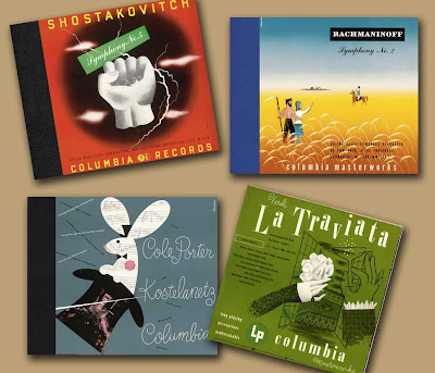
Alex Steinweiss is the father of album cover design. As art director at Columbia records, the 23-year-old graphic designer would turn out artworks that changed the music industry ––almost over night.

Steinweiss created the ‘album package’ which was promoted as his idea to create a visual style that celebrates the recording. It was his notion- Why not replace the standard plain brown wrapper with an eye-catching illustration? This concept created a whole new field of illustration and design that was paramount to the success of the record industry (within months Colombia’s record sales increased by over 800%). The Steinweiss style was quickly copied by competitors.


Some history-
It was in 1948 that Columbia presented the first LP format to the public. The single long playing disc had its obvious advantages––not the least of which was that it did not need the heavy box packaging of the 78 rpm records, and could now be sold in a much simpler sleeve. New packaging had to be designed, and Columbia asked Alex Steinweiss to design covers specifically for these long playing records.

Steinweiss took on the challenge with great enthusiasm, “I love music so much and I had such ambition that I was willing to go way beyond what the hell they paid me for. I wanted people to look at the artwork and hear the music.”

In his four decade career he created album covers for musical jazz greats such as Louis Armstrong, Duke Ellington, and classical heavy hitters such as Igor Stravinsky. His covers are certainly retro masterpieces.

Keep your eyes open and you just might be able to find one of these retro beauties––suitable for framing!

Wednesday, March 30, 2011

The Wonder Women of Retro Design

Design movements appear suddenly and sometimes without warning. The design we now term as "Retro" design began by a small number of New York female designers working primarily in the record and book publishing industry. 

A field known in the 1980s for its traditionally conservative ways was rocked by a new approach to cover design. The designers Paula Scher, Louise Fili and Carin Goldberg created works using graphics from the turn of the 20th century and between the World Wars mixing fonts and color combinations that playfully connected the kinky and eccentric typefaces of that period. In these Retro designs, the typography is the key element becoming a star and focal point of the composition.


Paula Scher is––without question––the wonder woman of the movement. In Retro, we see an important historical design lesson to keep our eyes affixed. It’s human nature to cherish a past and forgotten beauty––and in this case, the many grand characteristics found in historical design. Early 20th century design––hidden away like some magician prodigy under the stairs––was just waiting to be re-opened by an experimental designer like Scher. She admits openly that she would have done anything at the time to avoid using the popular Helvetica font (which she unwaveringly still detests). Working at CBS records during the 70s her work attracted national attention.

In 1978 the record industry crashed, as inflation took a powerful toll on what was an industry of healthy photography budgets. Scher used this situation to her advantage creating almost completely typographic solutions. Combining her design history knowledge and a fascination with lesser-known typefaces, Scher applied a Retro design approach to her design solutions.

Most designers would have avoided the forbidden typefaces she used completely, and no doubt, the response to her initial work was under whelming. But Scher’s vision eventually began to gain ground. Her typographic solutions were eye opening, as she pulled from the visual vocabulary of Russian Constructivism and Art Deco, while reinventing them with a modern twist. The Russian Constructivists were dead serious about communicating to the masses to support a new society that emerged after the revolution. Scher puts a whimsical twist on how this type and imagery can be used to communicate in a playful manner.

Not surprisingly, Louise Fili credits Scher as her main influence. Fili took frequent trips to Europe to unwind from the hectic schedule of book publishing at Pantheon books. It was Europe that provided her with the inspiration and a very original approach to American book jacket design in the early part of the 1980s. Wandering the Italian seashore resorts built between the World Wars, she began photographing the antique signage that was commonplace. Her passion continued as she began collecting European graphics from the 1920s, 30s and 40s that she found at French and Italian flea markets. These ornate styles were almost completely forgotten. 


After the Second World War the New Typography movement began as an international graphics style towards clarity, readability and a rejection of superfluous decoration.
Typefaces before then became so unused that they did not even make it into the conversion to photographic or digital form.


Like Scher, Fili reinvents these old typographic specimens adding color and imagery that reflect the spirit of the past while projecting the content of a book in a unique way.

It is in their efforts that the Retro design approach has become a current consideration of any art director’s vision. When used appropriately, Retro design can be a highly effective solution for any designer with an eye on the past.

Use judiciously is my warning. You’ll know when it’s just right to implement a Retro look into your project.

Saturday, March 12, 2011

The psychedelic artist-stoned out tripster or poster design genius?


The psychedelic posters produced in San Francisco between 1966 and 1968 have become a legend of contemporary Western culture and the psychedelic era often compared to the psychedelic trip itself. An unusual and extraordinary burst of creative spirit was driven by the music of Haight-Ashbury and the poster artists were no doubt embedded in this scene.

In the history of the modern poster, which barely covers two centuries, the psychedelic poster stands out––but were the artists driven by the LSD experience alone or were they modern geniuses of color achieving movement with variations of hue and optical effects?


Truly, these posters are art objects that historians do not know what to do with or what to make of. Not unlike the remembrance of the music, the drugs, the counter culture and alternative lifestyles, documentation of these artists is a bit blurry. As the popular joke goes, “if you remember Woodstock––you weren’t there.”


Most agree on the superiority of the work by the legendary artists of the psychedelic era known as the big five. They are: Wes Wilson, Victor Moscoso, Rick Griffin, Stanley Mouse and Alton Kelly. We also know that the psychedelic posters were almost always hand-lettered, and even though the text might have been based on existing typefaces of that era, the compositions were truly organic, that made much greater use of color contrast that has ever been seen before in the history of graphic design. It must be assumed then that one would have to have had an LSD experience to produce these vibrating works of art.

Wes Wilson's pre-psychedelic efforts
Wes Wilson is probably the best known of the big five known for his poster designs for Bill Graham owner and producer of the Filmore East and West concert venues. His early poster produced for the Beatles at candlestick Park in late August 1966 shows nothing of the route he would partake in his future endeavors. The text for this poster is highly readable and the design is static. The passages in Wilson’s psychedelic poster concoctions done for the likes of Jefferson Airplane and the Byrds would have one in a trance in the act of reading––if reading them was possible at all. In his posters of the late 60s and early 70s Wilson feathers the letter forms and build up his compositions with a series of asymmetric curves and opposing curves. Certainly his influences came from Art Nouveau, but the color sense used here is a lava lamp of LSD excitement. In an article appearing in Time magazine in 1967 and titled “Graphics: Nouveau Frisco,” Wilson listed Van Gogh, Alfonse Mucha, and Gustav Klimt among his influences––but the comparisons stop there. Very contrary to typographic tradition, Wilson took his lead from the world he was embedded in. 


Psychedelic rock included phenomenal light shows, with slide projections and strobe lights that were intended to kick in the sensory experience of LSD or mescaline. It is impossible to fathom the utopian ideality of the this era without considering the role of drugs and their influence on art and artists. Timothy Leary’s book the Politics of Ecstasy published in 1968, was well in sync with the findings of Dr. Humphrey Osmond, the author of the studies he made on the use of LSD and mescaline as a treatment for schizophrenia. In an article in Look Magazine in September 1959, none other than Cary Grant spoke out about his successful treatment with the drug. The posters created in Haight-Ashbury with their movement of swirls and spirals and clashing complementary colors were a clear reference to LSD participation. 


The psychedelic movement was quick to disappear and in the spring of 1967. Wes Wilson discontinued his work for Bill Graham (he noted for financial reasons). In October of that year, and anarchist performance group called the Diggers put together a well publicized San Francisco parade to parody a funeral that they entitled “Death of the Hippie-Son of Mass Media”.

The hippie, as well as psychedelic poster art, had died. The organic curvilinear letter forms like the ones seen on the Are You Experienced Jimi Hendrix album cover would soon be replaced by the sparse (but memorable)design done by Richard Hamilton in 1968 for the Beatles White Album.

Were the 60s psychedelic artists stoned out tripsters or poster design geniuses? 
Stoned out or not, the big five artists were master craftsman, geniuses of color, and compositional wizards that provided an invaluable reference to a culture that is still looked upon with enthusiasm by the younger generation of artists today. They did not copy the Masters of the Art Nouveau movement, but brought their own modern sense of originality that reflected the world around them.

When I was a very little kid my best friends brother did attend Woodstock. I know he was there–because he couldn’t remember anything about it either. He did, however, come back with one hell-of-a poster!

Friday, January 21, 2011

Moving Your Brain Through Retro Art Color


Artists have been trying to depict movement on a flat surface since cavemen were inspired to paint their hunting pursuits on cave walls. In the mid 60s, the art of creating optical movement reached its high point with the abstract style of art and graphics known
as Op Art.


Starting in Europe, and later working its way to the US, “Op Art” is short for optical art and was an approach that grew from the abstract expressionist movement. Artists would reduce these abstract geometric forms and repeat them to stimulate movement using contrasting color and shapes. After a major 1965 exhibition of Op Art entitled the Responsive Eye, the public went gaga with this movement as it quickly became attached to the 60s culture.

Time magazine first coined the phrase “optical art” in an article appearing in October of 1964. The term defined Op art as an art comprised of illusion, appearing to the human eye to be moving––and even breathing––due to its mathematically-based compositions of contrasting colors and forms.

In the mid-60s, Op art was the "groovy" art that was showing up everywhere- in advertising, television and as LP album art. It might even show up on a 60s household drapes or furniture as a fashion motif.

Staring at these concoctions of color for one minute and quickly looking away will give you the flashbacks you had at that Grateful Dead (or Phish) concert when you thought you melted into the floor. The Op art movement fit nicely spring-boarding off the Pop art movement that was inspired by mass consumerism and popular culture with the artists Andy Warhol, Roy Lichtenstein, and Richard Hamilton leading the way.

It was Hamilton that would later go on to describe this art form––so reflective of society at the time––as “popular, transient, expendable, mass-produced, young, witty, sexy and glamorous.” These movements were, no doubt, a reaction against the clean, sometimes rigid design of the 50s.

In the 60s, design was no longer just about form and function––it was about style. The Pop and Op Art movements in this decade were a reflection of a new found and much celebrated subculture which was one of freedom, permissiveness, and, most importantly, progress.


It’s also important to note that these movements existed in the cultural capitals of the world. In London, Paris and New York, Op and Pop art was an international phenomenon promoted by the lifestyle magazines that emerged during the decade. 

The retro color of these movements still inspire the youth of today, with psychedelic colors and posters memorialized in retro artt projects and activities everywhere.

Find me some Op or Pop art links and I’ll make you a really nice brownie!

www.flyingblindpuppy.com